Often content in an email is organized in multiple columns. When viewed on a mobile device, those columns can become too narrow and lead to a sub-optimal reading experience. To guarantee a better experience while reading emails on mobile devices, the editor generates HTML code that makes columns stack vertically. This way, content is reorganized to make zooming unnecessary and is easy to scroll with a finger.
Sometimes you may want to make changes to the default mobile optimization settings that the editor uses. There are plenty of different features you can use to do this. Let’s go over the different options that can impact the mobile version of your design.
Do not stack on mobile
Although it usually helps, there are cases where the vertical stacking of columns may not lead to an optimal result.
Typical scenarios include navigation bars, icons, and other horizontal design elements. For example, when using a row to display a navigation bar with text links, a vertical layout could take too much space, hiding important parts of the message or giving too much visibility at the top of the email to content that is not supposed to be that prominent.
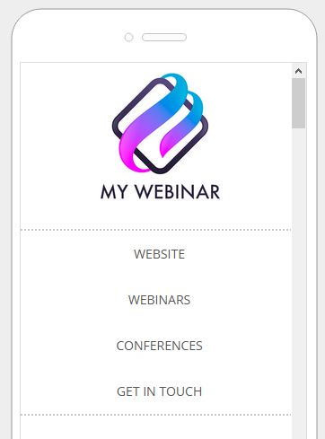
The Do not stack on mobile option is available inside Row properties, toggled off by default.
This setting allows users of the editor to decide when to override the default stacking behavior. Email design best practices suggest a careful use of this display setting. A user-friendly vertical layout on mobile makes sense in most cases. As always, it is up to you and your creativity when and how to use this option.
Reverse stack order on mobile
In some cases, the columns stacked on mobile can work better in a reversed order. In this case, you can toggle on Reverse stack order on mobile inside the row properties.
Here are two sections from an email message:
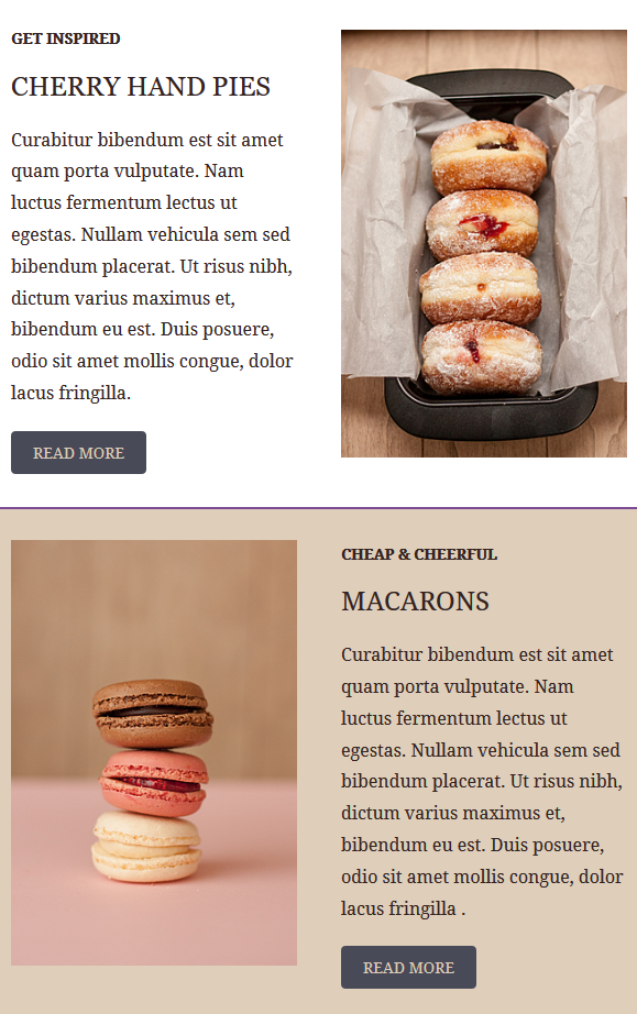
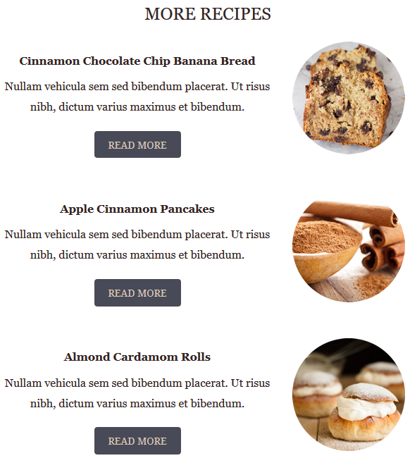
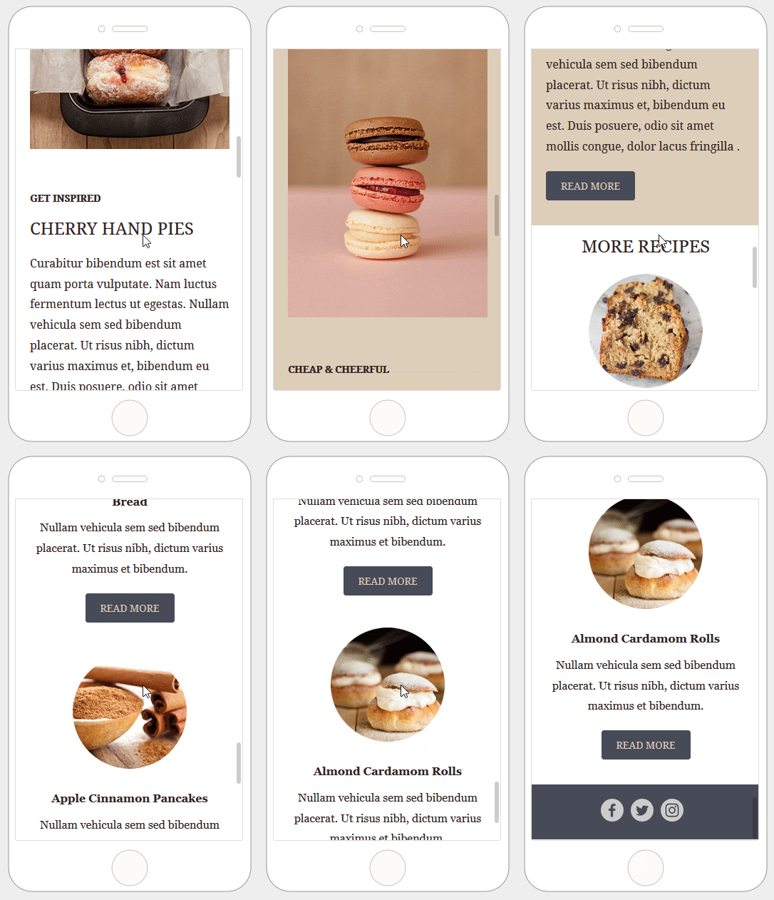
Here is how these two sections render on mobile by default:
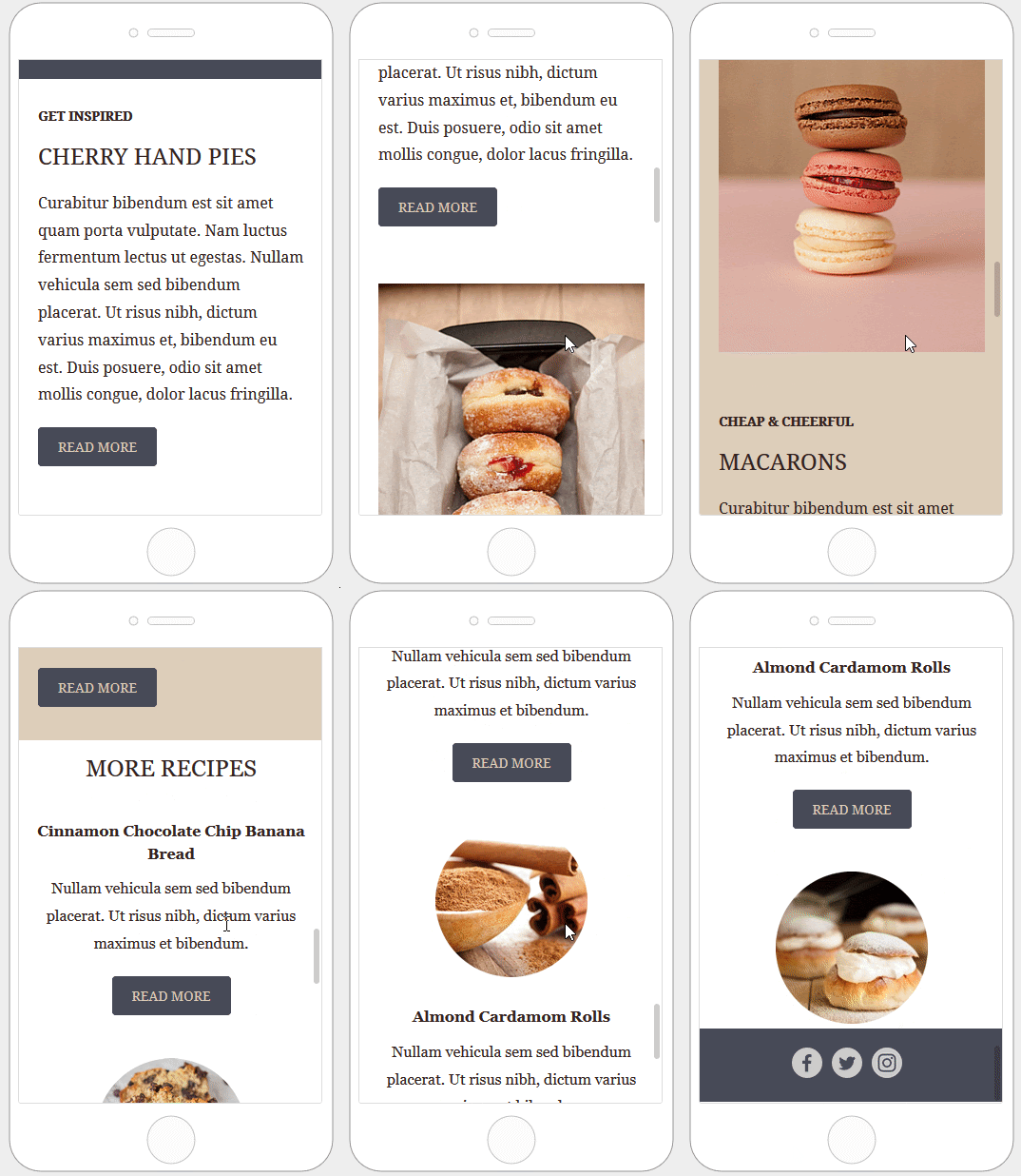
Here is how the email layout renders when you stack columns in reverse order.
Hide content on mobile or desktop
All content blocks in the editor include a Hide on setting in the content properties. To use it, scroll down until you see the “Block options” section.
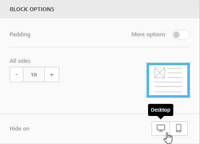
This setting is perfect for creating device-specific parts for your email, from things like optimized buttons for mobile, up to entire sections with different layouts on mobile versus desktop. In this last case, you may also want to hide an entire row on a device by using the same Hide on setting.
Hiding a row will apply the “Hide on” property to all the blocks inside that row. For this reason, when you hide a row:
- You won’t be able to change the “Hide on” setting for a block that is part of a hidden row.

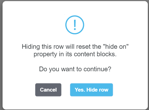
- Any “Hide on” setting applied to blocks will be reset. The editor will ask you for a confirmation in this case.
Once you’ve finished hiding content, you can check the results by going into the message preview.
Mobile design mode
With Mobile design mode, you can easily design emails and pages for mobile without the need to switch back and forth between editing and preview. When enabled, you'll be able to move between desktop and mobile view to see and edit content. This way, you understand how your design looks on mobile without leaving the editor to go into preview.
You will see two icons in the upper left corner, one for desktop and one for mobile.

The desktop view will use the full width available in your browser window. Clicking on the Mobile icon will reduce the work area width to 320px. This view retains most of the editor's functionality, so you can continue working as usual, while getting an immediate look at the mobile rendering of your email.
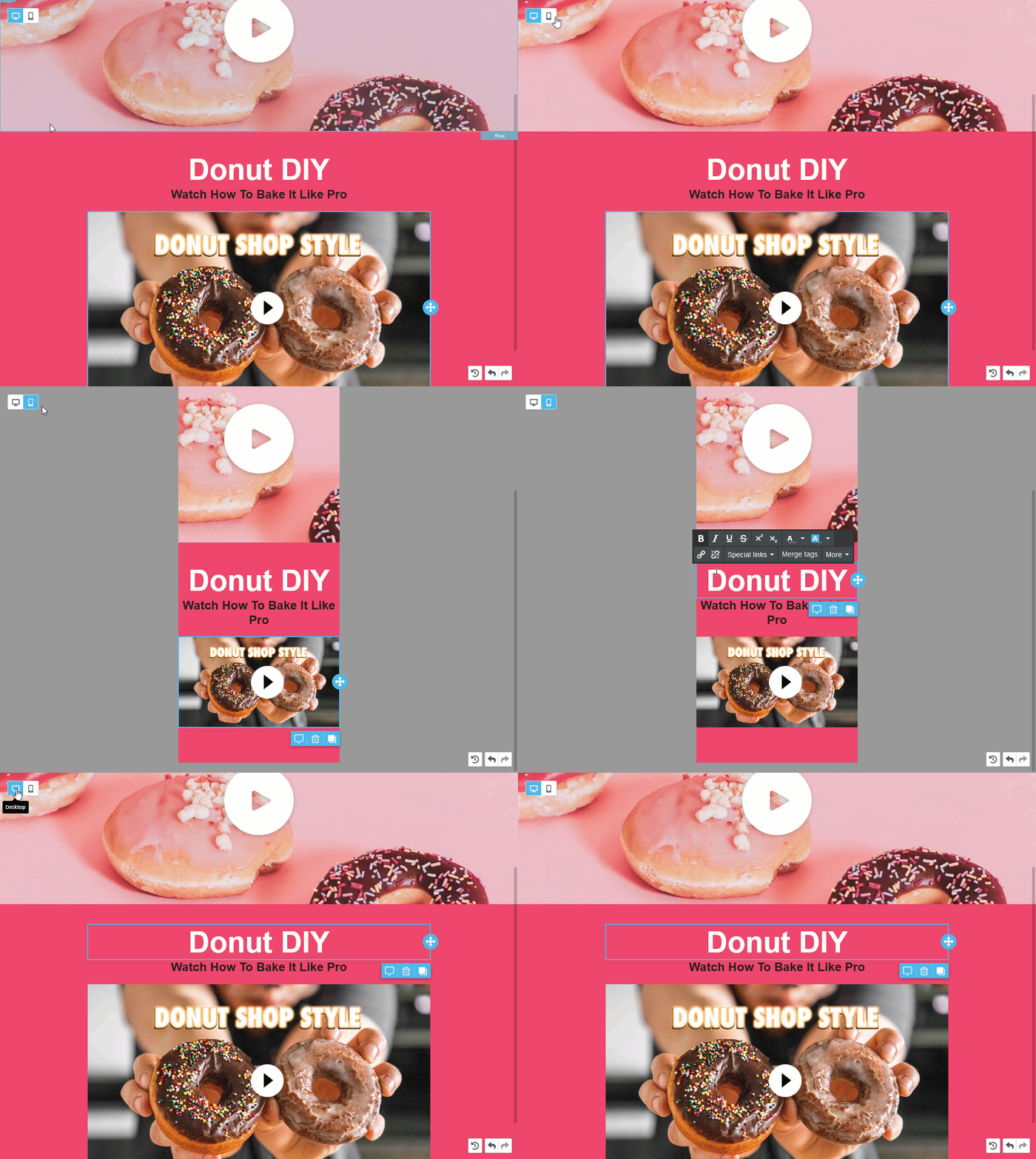
Another advantage of Mobile design mode is that you can instantly visualize the results of mobile optimization options - such as do not stack/reverse stack/hide on mobile - and stretch out the editor's design flexibility. Using these settings becomes more convenient, as you can immediately see their effect in the desktop and mobile views.
An important note: with Mobile design mode, you are still working on a single template with the same content. These are not two separate versions of the template. Unless a content has a device-specific setting, the desktop view will reflect edits made in the mobile view.
When using the Hide on setting, you'll get an additional aid: a "Visibility" icon next to the Desktop and Mobile icons.
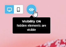
When Visibility is ON (the default behavior)
- the editor will display content blocks set as hidden for the current device;
- Those blocks will have a blurred effect to signify that they are hidden for that device;
- They will also have a small icon in the outline of the block when hovering with the mouse;
When Visibility is OFF
- elements set as hidden for the current view are removed
- the template will appear as the version of the email/page meant for mobile audiences
Editor limitations in mobile view
When in mobile view, the editor retains most of its functionalities, with a few exceptions:
- You cannot change text in text elements - text blocks, titles, buttons -, and the text toolbar won't pop up, so you can only make changes in the editor's sidebar.
- You cannot change the content area width; it can only be changed in the desktop view;
- You can add and delete columns in a row, but you cannot resize them.

Comments
0 comments
Please sign in to leave a comment.